
")


Featured Projects:
Showcase of Creativity
Breeze Web Studio Portfolio
80+ Reviews with a 5 star rating

lawn care services
Turf King

Basketball Coaching Program
Transforming

Business Planning Coach
Inspired Mark

Therapy Practice for New Yorkers
Irene Sofia
")
WELLNESS CENTER
ACUPOINT

NATIONAL BOOK CLUB COMMUNITY
BTC

Restaurant in Nashville
Cherries


Women's Coaching Collective
Hello You
Holistic Healthcare Service
Acupoint
Overview
CLIENT
Acupoint sought a new design and improved UI/UX experience to showcase their services more aesthetically, making it easier for customers to navigate and understand their offerings.
Enhancing the Holistic Wellness Journey
Acupoint, located in downtown Vancouver, offers holistic healthcare services including acupuncture, IV vitamin therapy, osteopathy, massage, and naturopathic medicine. Their goal is to restore balance, alleviate pain, and enhance overall well-being. With new customers visiting daily, Acupoint needed a smoother flow and better photos to complement their services. They sought a new design and improved UI/UX experience to showcase their offerings more aesthetically, making it easier for customers to navigate and understand what they provide.
Branding Colors
Acupoint's website and brand colors needed to represent a welcoming and serene atmosphere, enhancing the user experience and aligning with the clinic's focus on well-being and balance. Using mainly blues, because it adds a sense calmness and clarity, making the site approachable yet professional. Lighter shades introduce tranquility and openness, enhancing user experience by creating a welcoming atmosphere. Lastly, a light olive green, suggests growth and eco-friendliness, reflecting Acupoint's commitment to sustainable practices. Together, these colors form a cohesive palette that not only enhances readability and user engagement but also reinforces Acupoint's brand identity as dependable, serene, and environmentally conscious.
Calm and Collected


Branding For Clarity
Tools and Deliverables
Project Details
DELIVERABLES
Photoshop
Showit
Business Cards
Website
CMS
Illustrator
TOOLS USED


Logo & Branding

Lawn Care & Maintenance Service
Turf King
Overview
CLIENT
We teamed up with McGrawesome Design to rebrand Ontario's leading lawn care & maintenance service. We developed a new identity with all kinds of branded collateral for Turf King.
Revitalizing a Cherished Lawn Care Service
Turf King has been around since 1962 and was a leader in environmental safety. There was a steadfast commitment to using the safest and most effective lawn maintenance products. In 1994 the owner passed down the business to his son, in turn he created a simple brand identity. Times have changed and now that Turf King has turned into a franchise the owners knew they needed a new fresh updated look and cohesive brand feel for the business.
LOGO DESIGN & CUSTOM TYPOGRAPHY
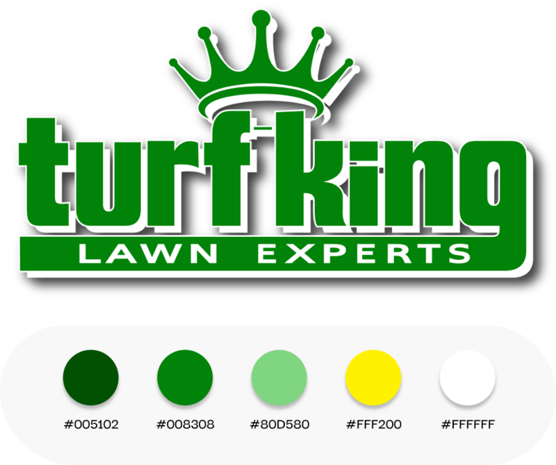
Following our research, we promptly recognized that the term "Turf King" is widely employed by numerous businesses within this particular industry. To distinguish our clients' business from their rivals, three essential strategies were identified. Firstly, we opted for a distinctive approach by designing a custom typeface with substantial, bold characters, creating a visually striking impact when compared to any other "Turf" entities visible on Google. Secondly, we curated a color palette that embodies all seasons, acknowledging the year-round nature of lawn care services. Lastly, we knew that a crown needed to be included into the design.
Big and Bold

Regarding the submark, we had already decided to incorporate the crown from the primary logo. However, selecting the appropriate crown style was a crucial consideration. Our aim was to create a crown design that struck a balance between not leaning too heavily towards notions of royalty on one hand, and avoiding an overly fantastical fairytale appearance on the other. We iteratively crafted mockups, drawing inspiration from various sources, and explored numerous combinations. Ultimately, through this process, we arrived at the ideal crown design that seamlessly complemented the overall aesthetic.
A Submark With a Lasting Impression

Brand Guidelines


Unleashing a Bolder Website
When the moment arrived to craft a fresh website for Turf King, we seamlessly blended graphics, colors, and photography to fashion a digital space that perfectly embodied the essence and style outlined in the new brand guidelines.
Tools and Deliverables
Project Details
DELIVERABLES
Photoshop
Squarespace
Business Cards
Website
CMS
Illustrator
TOOLS USED


Illustrations
Logo & Branding
National Book Club Community
Between The Covers
Overview
CLIENT
Madison Bynum the founded Between the Covers in 2018, with a growing community nationwide, and thousands of members, BTC needed a cohesive look to come into play, as well as a improved UI/UX experience to help her and her team for new members.
Bringing the Book Community Closer
With over 1000 members, BTC fosters authentic friendships and personal growth through local chapters, events, and a focus on inspirational books. The community emphasizes support and the pursuit of personal bests. With new members joining daily and interest in their "Recharge" retreat, BTC needed a smoother flow for their audience. They sought an improved UI/UX experience to streamline sign-ups and reduce the administrative burden on Madison and her team, allowing them to focus more on the community and less on background tasks.
Branding Colors
These colors work together to create a sense of warmth and connection. The neutrals bring comfort and softness, coral adds vibrancy and excitement, brown grounds the palette with stability, and teal brings in a calming balance. The overall feel is supportive, uplifting, and trustworthy — perfect for a community-focused brand.
Warm & Welcoming
Tools and Deliverables
Project Details
DELIVERABLES
Photoshop
Showit
Logo & Branding
Website
CMS
Illustrator
TOOLS USED


Network and Podcast
Hello You Collective
Overview
CLIENT
Hello You collective desired to revamp their website to mirror their branding kit, seeking a more unified appearance and the opportunity to highlight their new podcast.
Sculpting Confidence, Crafting Futures:
Hello You Collective needed a new website because it emerged from a personal realization and a desire to address the challenges faced by individuals going through significant life changes, particularly as they approach the age of 50. Hello You Collective aims to provide support, guidance, and resources for people who are experiencing similar feelings of self-reflection, insecurity, and uncertainty associated with aging and life transitions. To effectively communicate its mission, services, and resources to its target audience, a new website was necessary. The website would serve as a platform to share information, offer solutions, and create a community that helps individuals navigate this stage of life with confidence and a sense of identity, countering stereotypes and misconceptions about aging.
LOGO DESIGN & CUSTOM TYPOGRAPHY
Hello You Collective's logo is a bold and feminine design that intentionally stands out with the prominent use of the color pink. The logo features a harmonious blend of elements that convey its unique brand identity.
Color Choice - Pink is the dominant color in the logo, symbolizing femininity, warmth, and compassion. It immediately grabs attention and establishes a strong emotional connection with the target audience.
Branding Color Pallete: We chose soft colors, such as pastel pinks, blues, and greens, evoke feelings of comfort, warmth, and serenity. These emotions are essential for a brand focused on supporting individuals through significant life changes and self-discovery.
Bold Typography: The typography used in the logo is bold and modern. The letters are well-defined and have a strong presence, reflecting the brand's confidence and determination to help individuals embrace their changing selves.
Bold but Feminine


Brand Guidelines

Our intention was to emphasize the target audience and the website's purpose. To achieve this, we integrated the number '50' to symbolize the age group we're catering to. Additionally, we introduced a star element to signify that individuals in this age group still possess radiance and beauty. The choice of a flowing font was deliberate, as it represents the continuous flow of life. Moreover, we sought to incorporate elements reminiscent of waves on the outer design, mirroring the way life presents us with its ups and downs.
A Symbol of Empowerment

Unveiling a More Empowered Website
When the time came to create a new website for Hello You Collective, we harmoniously blended visuals, color palettes, and imagery to craft a digital environment that authentically captured the spirit and aesthetics outlined in our updated brand guidelines.


Tools and Deliverables
Project Details
DELIVERABLES
Figma
Showit
Logo & Branding
Illustrations
Website
CMS
Illustrator
TOOLS USED
Photoshop
Therapy Practice for New Yorkers
Irene Sofia Therapy
Overview
CLIENT
Irene Sofía, a bilingual therapist specializing in EMDR and trauma recovery, needed a website that felt as welcoming as her practice. The new design highlights her warmth and professionalism, while creating a clear, supportive flow for clients to learn about services and book sessions with ease.
Nurturing Healing & Growth Through Therapy
Irene Sofía Therapy offers a compassionate space for individuals navigating trauma, anxiety, and life transitions. With a focus on EMDR and somatic-based practices, Irene helps clients move beyond survival mode into deeper healing and self-discovery. The redesigned website highlights her warmth and professionalism, guiding visitors seamlessly toward booking sessions, exploring resources, and feeling supported from their very first click. This new design eases the journey for those seeking therapy, creating a flow that reflects Irene’s holistic approach to care.
Branding Colors
This palette blends warmth, stability, and calm to reflect Irene’s therapeutic approach. The soft cream and peach tones invite openness and comfort, while the deep navy adds professionalism and trust. Green brings in a natural sense of balance and growth, and the earthy orange adds energy and approachability. Together, these colors create a brand presence that feels both grounded and welcoming, mirroring the safe space Irene provides for her clients.
Professional & Grounded
Tools and Deliverables
Project Details
DELIVERABLES
Photoshop
Squarespace
Icons & Assets
Website
CMS
Illustrator
TOOLS USED


Logo & Branding
Network and Podcast
The Inspired Mark
Overview
CLIENT
Hello You collective desired to revamp their website to mirror their branding kit, seeking a more unified appearance and the opportunity to highlight their new podcast.
Elevating The Inspired Mark’s Presence
Jessica Miller needed a beautifully designed brochure to share her curated list of tech tools with clients and business owners. This guide not only organizes essential resources like scheduling, client management, and design platforms, but also reflects Jessica’s approachable brand through a clean, feminine layout. The final design blends functionality with style, making it easy for readers to navigate while reinforcing Jessica’s expertise as a trusted business mentor.
The Tech Tool Guide


Tools and Deliverables
Project Details
DELIVERABLES
Figma
Showit
Logo & Branding
Illustrations
Website
CMS
Illustrator
TOOLS USED
Photoshop


The Inspired CEO Kit
The Changemakers Circle — Mastermind Program
A sub-brand logo created specifically for Jessica’s 6-month coaching mastermind. It carries the same design language as the main brand but emphasizes transformation, community, and leadership to distinguish the program as a premium offering.
Logos That Work Together, Yet Stand Alone

The Inspired Mark — Website
The primary brand logo representing Jessica Miller’s business as a whole. It sets the tone for her professional identity and serves as the umbrella brand across all platforms.
Jessica Miller, founder of The Inspired Mark, needed a cohesive brand presence to support the launch of her Changemakers Circle program. This included a fresh web design, a professional logo, a polished brochure, and a podcast cover — all working together to present her message with clarity, consistency, and impact.”
Elegant and Impactful

Created to help entrepreneurs step into their role with confidence, The Inspired CEO Kit provides a simple yet powerful framework for running a business with clarity and intention. The design balances bold, energetic visuals with a clean layout, making the guide both motivating and practical. It empowers business owners to take charge of their strategy and self-care, so they can run their business — rather than letting it run them.
A Checklist for Purpose-Driven Entrepreneurs
Brand Logos
Profit on Purpose Podcast
Jessica Miller needed a bold and professional podcast cover to represent her brand, Profit on Purpose. The design had to capture attention on crowded platforms while staying consistent with her overall brand identity. The final cover balances clarity and personality, ensuring her message of aligning profit with purpose is instantly recognizable to listeners.
A Cover Design that Stands Out in the Digital Space
Family Mediation
Prestley Mediations
Overview
CLIENT
Former Judge Linda Prestley ventured beyond the legal field to assist families seeking mediation services, requiring the development of a complete suite of elements, including brand identity, web design, and marketing materials like business cards, starting from scratch.

Establishing a Trusted Family Mediation Service
Judge Linda Prestley sought our assistance in building her brand from the ground up. With a distinguished legal background, a Harvard degree, and a successful career as a judge, Linda decided to embark on her entrepreneurial journey. Her vision was to establish a prominent presence in the Connecticut and Massachusetts regions, where she could extend her services to families in need.
LOGO DESIGN & CUSTOM TYPOGRAPHY
Linda aimed to maintain her surname as an integral part of her brand, as "Judge Prestley" had already become associated with her in the courtroom. She sought to preserve this familiarity. We opted for a blocked typography style to convey a sense of significance, but we also desired to convey a softer aspect since Linda would be assisting families during challenging times. To achieve this, we integrated a circular element to represent balance and unity.
Regarding the color palette, we predominantly utilized shades of blue. Light blue was chosen to signify trust, while dark blue represented professionalism. We added a touch of yellow as an accent to make specific elements stand out.
Keeping it Simple


Tools and Deliverables
Project Details
TOOLS USED
DELIVERABLES
Figma
Illustrator
Logo & Branding
Illustrations
Business Cards
Photoshop
Website
Showit
CMS


")


